Tuesday, June 1, 2010

ASSIGNMENT 5

1. My most significant achievment in photoshop this quarter is my new use of photoshop. Previously photoshop was a tool I used to place people inside my own buildings. Now Photoshop has become a tool I use to create meaning inside my works. It is a very powerful piece in my toolset for art and architecture.

2. My final was the most challenging piece to create for a multitude of reasons. The most challenging part of the project was creating an image that was well balanced while also filled with visual difference. Color is a very dangerous tool to work with. Not only does the artist have tone but they lightness and darkness as well. I tried to use color to my advantage. I successful used it to call out things that I wanted to become visually appealing. I allowed the back ground details that were not completely pertinent to my piece to fade away with their black and white colors. Meshing each photoshop item into a coherent and correct image was difficult but ultimately successful in my final project.

3.
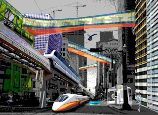
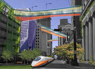
My midterm and final are the easiest projects to compare and contrast. Both use similar techniques to have fairly similar passions. The subject matter obviously explains my love of architecture and the future. Color is a huge tool in both. It is used to both call out difference and emphasize certain aspects of my subject matter. However, each picture has different a different tone about the future. One image has a cautious almost scary tone to it. This image speaks about the far future. The posterized filter also adds to the mystery of it. Posterizing the image allowed for me to take the crispness out of the image because the future is uncertain. The other image has a more optimistic tone. With green spaces and a blue sky, the viewer is immediately brought to a familiar spring scene of happiness. The crispness of each image also goes to explain the ability for cities to take on these type of characteristics.

Tuesday, May 18, 2010

blog 4


Final Project!

I focused on a futuristic urban scene for the midterm. The urban landscape satisfied my passion of architecture while the placement of the technologically advanced items spoke about my love of technology. For my final, I want to revisit these passions in a different way. I think it is important to keep the main street image for an architecture feel. However I want to rethink want advanced futuristic items i place in the image. I want
to portray an image of what i think the future city will have. This will most certainly include a
feeling of environmentally friendly buildings
with a lot of green space. The green space will also speak to my love of the outdoors an environment. I will attempt to use a metallic filter on everything to maintain a common theme throughout the picture. This filter is new and must not be abused.


Multiple artists have had an influence on my thinking and art making process. I have already mentioned one previously in a blog. Renzo Piano's new shift into green architec
ture has proved to be a big help. He makes the adjustment from conceptual architecture to conceptual green architecture seamlessly. Many times that jump hinders the actual architecture but his has not suffered.

Another artist that has started to influence my green thoughts is danish artist Morten Flyverbom. She has focused on creating art with a green tone to get the viewer to think about the enviroment. She has also used plants in her physical art. One of my favorite pieces is a graffiti piece in which the actual writing is not done in spray paint but moss. The moss is obviously environmentally friendly but doesnt stop there. A new texture is added which to otherwise flat art making. Also, the art is living and incorporates a new fourth dimension...... time. Every day the image will look more and more different.


The idea of futurism is also something that has begun to influence me. Many times futurist's art is abundant with metallic colors and non organic shapes. This is something that i look to include in my images to give the feel of the future and technological advances. Some of the art influencing me is shown below.

Monday, May 10, 2010

Artist Two


Artist Number Two
___ Dan Flavin

Flavin is an abstract minimalist artist working with a very industrialized medium. Flavin uses fluorescent lights to achieve his intended affects. Where most artists are using pigments and shades to express the drama light creates in the world, Flavin uses light. The drama created by light is emphasized by his configuration and composition. he makes little attempt to hide or refine the industrial look of each lamp or connection. Flavin's art is appealing because of the drama and unique use of material throughout. He has architectural ties with his material and relates that to art with his

compositions.http://www.nga.gov/exhibitions/flavininfo.shtm

Tuesday, May 4, 2010

Artist Number One
__Architect - Renzo Piano


http://www.medindia.net/news/Famous-Italian-Architect-Renzo-Goes-Green-for-Environmental-Conservation-45559-1.htm
www.max4object.com/images/California%2520Academy%2520of%2520Sciences/6.jpg&imgrefurl

Renzo Piano is a popular and famous Italian architect. He is interesting because of his serious contributions to architecture and his interest in reality with high
ly conceptual design. Recently he has begun to seek natural preservation as an influence in his work which is informing my big idea. There is always great care in the contemplation of structure materiality and feeling with his work that is rivaled by very few. The recent focus on "green" buildings has provided an inspiration to many. Green architecture can have a negative connotation because the architect becomes so involved in making the space environmentally friendly that they forget the user. However, Piano does not overlook either aspect and creates a building which engages nature and its users.

Sunday, April 25, 2010

RASPBERRY FROG

STEP ONE
I started with an image of a frog and raspberry. After putting each image on its own layer, I used the liquify filter to start to have the individual berries conform the the frog's overall form. Drastic changes end up making the image look unrealistic, so I have tried to keep them very minimal.


STEP TWO
Continuing with this technique, I have finished each portion of the frog that would have the raspberry texture. Each portion has its own layer. I scaled the raspberry texture down on each leg because in real life the texture would be much more refined. I continued to keep the image of the frog underneath my new textured frog to keep things in perspective.
STEP THREE
To finish the image, I took very specific frog parts from the original image and pasted them into the final picture. I used the color balance adjustments to have them match in tone to the new berry frog. I also adjusted the size and color of the eye to have it fit more correctly into the picture. Using the liquify tool was challenging because things could become out of control very easily. also maintaining the texture of the raspberry while also being true to the form of the from created multiple challenges. Its not just enough to have the texture on the image. One has to think about the way the texture would move around curves and other features of the frog. This image was created after viewing a tutorial from worth1000.com. the link can be found here http://fx.worth1000.com/tutorials/161408/how-i-created-raspberry-frog

Monday, April 12, 2010

Mark Napier


Title- "Pam"

Denotations-
The artist is using multiple internet images of Pamela Anderson to create a new image of the actress.

Connotations-
Napier is playing off of two different aspects of the actress. He uses Pam to make a statement about beauty. She is known in mainstream media as a beautiful and sexy actress. In many of her pieces she plays the seductress gaining most men's attention because of her well accepted body figure and outer beauty. To many men she is seen as perfect. However, Napier calls out her imperfections by creating her image from a collage of her own pictures.
It takes out her perfection and brings light to the scewed way many men think about women.


Pam Standing

Dictation
The artist is using multiple internet images of Pamela Anderson to create a new image of the actress.

Connotation
Here napier is again Playing off of Pamela Anderson's beauty.
He achieves a new level of criticism with the collage. In reality Pamela is known to have had plastic surgery and also receives a lot of make-up attention to achieve some of the outer beauty she has. Napier skews This and pokes fun at this culture which accepts people who would rather artificially enhance their beauty by any means necessary which actually destroys any true beauty the original person or image ever had.